Android UI框架提供了一套完整的绘图工具来构建UI,以及丰富的基于这些工具的预构建的组件组合。正如第8章将介绍的,Android UI框架的图形工具为应用提供了很多支持,以便应用可以方便地创建自己的控制按钮或渲染出特殊的视图。另一方面,很多应用可能只使用工具箱里的视图就可以良好工作。实际上,类MapActivity和类MyLocationOverlay可以支持非常复杂的应用的创建,而不需要执行任何自定义渲染。
我们之前已经使用了术语部件,但没有显式定义它。屏幕是由组件树渲染的。在Android UI框架中,这些组件都是android.view.View的子类。在视图树中,叶子节点或接近叶子节点的节点执行了大部分的实际渲染工作,在应用UI中,这些节点通常被称为widget。
内部节点,有时称为容器视图(container views),是特殊的组件,可以包含其他子组件。在Android UI框架中,容器视图是android.view.ViewGroup的子类,它当然也是View的子类。它们通常很少执行渲染工作。相反,它们主要负责安排其子节点在屏幕上的视图,并且当视图形状、方向等改变时,还保持这些节点的位置排列。这些工作实际上很复杂。
要创建复杂的显示,还需要对应用中要使用的视图的容器树进行组装。例6-1显示了一个包含三个层次的视图树的应用。一个垂直的线性布局中包含了两个水平的线性布局。每个水平布局又分别包含了两个部件。
例6-1:一棵复杂的视图树
package com.oreilly.android.intro;
import android.app.Activity;
import android.graphics.Color;
import android.os.Bundle;
import android.view.Gravity;
import android.view.ViewGroup;
import android.widget.Button;
import android.widget.EditText;
import android.widget.LinearLayout;
public class AndroidDemo extends Activity {
    private LinearLayout root;
    @Override
    public void onCreate(Bundle state) {
        super.onCreate(state);
        LinearLayout.LayoutParams containerParams
            = new LinearLayout.LayoutParams(
                ViewGroup.LayoutParams.FILL_PARENT,
                ViewGroup.LayoutParams.WRAP_CONTENT,
                0.0F);
        LinearLayout.LayoutParams widgetParams
            = new LinearLayout.LayoutParams(
                ViewGroup.LayoutParams.FILL_PARENT,
                ViewGroup.LayoutParams.FILL_PARENT,
                1.0F);
        root = new LinearLayout(this);
        root.setOrientation(LinearLayout.VERTICAL);
        root.setBackgroundColor(Color.LTGRAY);
        root.setLayoutParams(containerParams);
        LinearLayout ll = new LinearLayout(this);
        ll.setOrientation(LinearLayout.HORIZONTAL);
        ll.setBackgroundColor(Color.GRAY);
        ll.setLayoutParams(containerParams);
        root.addView(ll);
        EditText tb = new EditText(this);
        tb.setText(R.string.defaultLeftText);
        tb.setFocusable(false);
        tb.setLayoutParams(widgetParams);
        ll.addView(tb);
        tb = new EditText(this);
        tb.setText(R.string.defaultRightText);
        tb.setFocusable(false);
        tb.setLayoutParams(widgetParams);
        ll.addView(tb);
        ll = new LinearLayout(this);
        ll.setOrientation(LinearLayout.HORIZONTAL);
        ll.setBackgroundColor(Color.DKGRAY);
        ll.setLayoutParams(containerParams);
        root.addView(ll);
        Button b = new Button(this);
        b.setText(R.string.labelRed);
        b.setTextColor(Color.RED);
        b.setLayoutParams(widgetParams);
        ll.addView(b);
        b = new Button(this);
        b.setText(R.string.labelGreen);
        b.setTextColor(Color.GREEN);
        b.setLayoutParams(widgetParams);
        ll.addView(b);
        setContentView(root);
    }
}
注意,该代码保留了视图树的根节点的引用,在后面会用到它。
这个例子使用了三个LinearLayout视图。LinearLayout视图,正如其名,表示在视图中根据定位属性,以行形式或列形式显示子节点。子视图的显示方式和其插入到LinearLayout的顺序一致(和其创建的顺序无关),其显示方式对于西方读者很熟悉:从左到右、至上而下。例如,标签为Green的按钮在该布局的右下角,因为它是第二个插入到水平LinearLayout视图中的,而这个水平线性视图又是第二个插入到根节点即垂直的LinearLayout中的。
图6-2显示了从用户角度看的可能结果。树中的7个视图是结构化的,如图6-3所示。
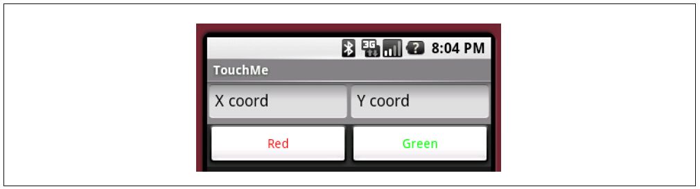
图6-2:用户看到的面板
Android框架支持很方便地把数据源和代码进行分离,这一点对于构建视图布局是非常有用的。前一个例子可以被例6-2所示的简单得多的代码以及例6-3所示的视图布局XML定义所替换。
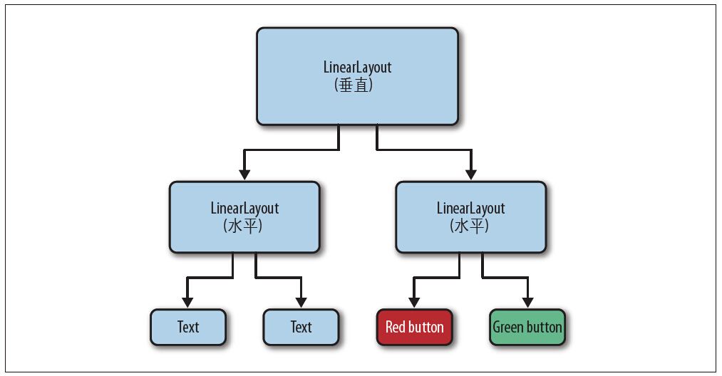
图6-3:视图中的层次
例6-2:使用布局资源的复杂视图
package com.oreilly.android.intro;
import android.app.Activity;
import android.os.Bundle;
/**
 * Android UI demo program
 */
public class AndroidDemo extends Activity {
    private LinearLayout root;
    @Override public void onCreate(Bundle state) {
        super.onCreate(state);
        setContentView(R.layout.main);
        root = (LinearLayout) findViewById(R.id.root);
    }
}
例6-3:一个复杂视图布局资源的XML定义
<LinearLayout xmlns:android=\"http://schemas.android.com/apk/res/android\"
    android:id=\"@+id/root\"
    android:orientation=\"vertical\"
    android:background=\"@drawable/lt_gray\"
    android:layout_
    android:layout_>
<LinearLayout
    android:orientation=\"horizontal\"
    android:background=\"@drawable/gray\"
    android:layout_
    android:layout_>
<EditText
      android:id=\"@+id/text1\"
      android:text=\"@string/defaultLeftText\"
      android:focusable=\"false\"
      android:layout_
      android:layout_
      android:layout_weight=\"1\"/>
<EditText
      android:id=\"@+id/text2\"
      android:text=\"@string/defaultRightText\"
      android:focusable=\"false\"
      android:layout_
      android:layout_
      android:layout_weight=\"1\"/>
</LinearLayout>
<LinearLayout
    android:orientation=\"horizontal\"
    android:background=\"@drawable/dk_gray\"
    android:layout_
    android:layout_>
<Button
      android:id=\"@+id/button1\"
      android:text=\"@string/labelRed\"
      android:textColor=\"@drawable/red\"
      android:layout_
      android:layout_
      android:layout_weight=\"1\"/>
<Button
      android:id=\"@+id/button2\"
      android:text=\"@string/labelGreen\"
      android:textColor=\"@drawable/green\"
      android:layout_
      android:layout_
      android:layout_weight=\"1\"/>
</LinearLayout>
</LinearLayout>
该版本的代码和第一个版本的类似,也保留了到视图树的根节点的引用。它保留根节点引用的方式是在XML布局(在这个例子中,即根节点LinearLayout)中给widget打上一个标签android:id,然后使用Activity类的findViewById方法来获取引用。
使用资源来定义视图树的布局结构是一个良好的思路。这种方式使我们能够从代码中分离出视图的可视化布局。修补屏幕布局就不再需要重新编译了。然而,更重要的是,你可以使用一些工具来构建自己的UI,采用这种思路你就可以使用可视化UI编辑器编写屏幕元素。
注意:在Google I/O 2011会议上,Android工具团队介绍了一种新的编辑器,其功能很令人兴奋。它甚至可以预览动画和开发人员创建的视图。大部分开发人员在对视图进行布局时不需要查看XML代码,那些内嵌的代码被查看的可能就更加渺茫了。